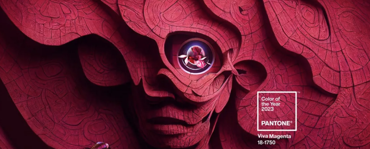
Say hello to all things colorful. Here’s how to spice up those sad and drab interiors. WOW! What a big shift from Agreeable Gray to Viva Magenta! I call that shifting gears while in motion! I love the magenta, but WOW what a dramatic shift and I question if this is the palette of the room for the walls or if the walls are the neutralizing palette embracing decor, art, pillows, throws, etc. with bright, bold pops of dramatic color?
For years, the color “millennial gray” has been everywhere, dominating fashion and home decor trends and becoming synonymous with modernity and sophistication. However, its popularity has peaked. Millennial gray is going out of style, and more vibrant, lively colors are taking its place.
Here are some reasons for the transition and how to incorporate brighter shades into a home to make it more inviting.
Out With the Gray
It’s important to understand what made millennial gray so popular in the first place. The color was named after the generation born between 1980 and 2000 and was seen as a reflection of millennials’ values—minimalist, practical and versatile. It symbolized a move away from previous generations’ rustic, faux-Tuscan villa style and toward a more understated and effortless look.
However, millennial gray became ubiquitous as more people jumped onto the bandwagon. It lost its unique appeal and started to feel bland and uninspired. Individuals began to crave something different that would stand out in a sea of sameness.
In With the Hues
There’s a growing desire for boldness and experimentation. People are seeking ways to express themselves through color rather than playing it safe with a tried-and-true trend. This shift toward bright shades and statement pieces means millennial gray is no longer the default choice for those who want to stay on trend. Keep this in mind when you stage a home: People want to see houses with personality and charm, and using color will help you achieve that effect.
Here are several advantages of using color to liven up a space:
- Brightens things up: Colors make a space look brighter and more inviting. Dark or muted shades can make a room feel smaller while bright tones have the opposite effect. The use of color works especially well for smaller spaces, like studio apartments that are only 300 to 1,000 square feet(link is external).
- Adds personality and charm: Bright color adds personality and character to a space, making it more dynamic and interesting. A pop of color also can help create a focal point in a room, drawing attention to specific features or architectural elements.
- Makes a statement: Colors can help differentiate a space from others, making it unique and memorable. You want people to remember the room and how it made them feel, particularly as they try to imagine how they would use the home themselves.
How to Incorporate Color Into Your Staging
People are stepping away from gray and beige and leaning toward colors inspired by the natural world. The paint colors of 2023 reflect this transition and point to the soft and expressive shades that will emerge in 2024.
“Redend Point” by Sherwin Williams works well as a neutral for walls, curtains and bigger pieces of furniture, like couches. “Redend Point” color.
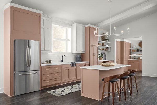
Photo credit: Sherwin-Williams
“Gentle Violet” by Valspar also works as a neutral or an accent color in a reading nook.
Gentle violet color
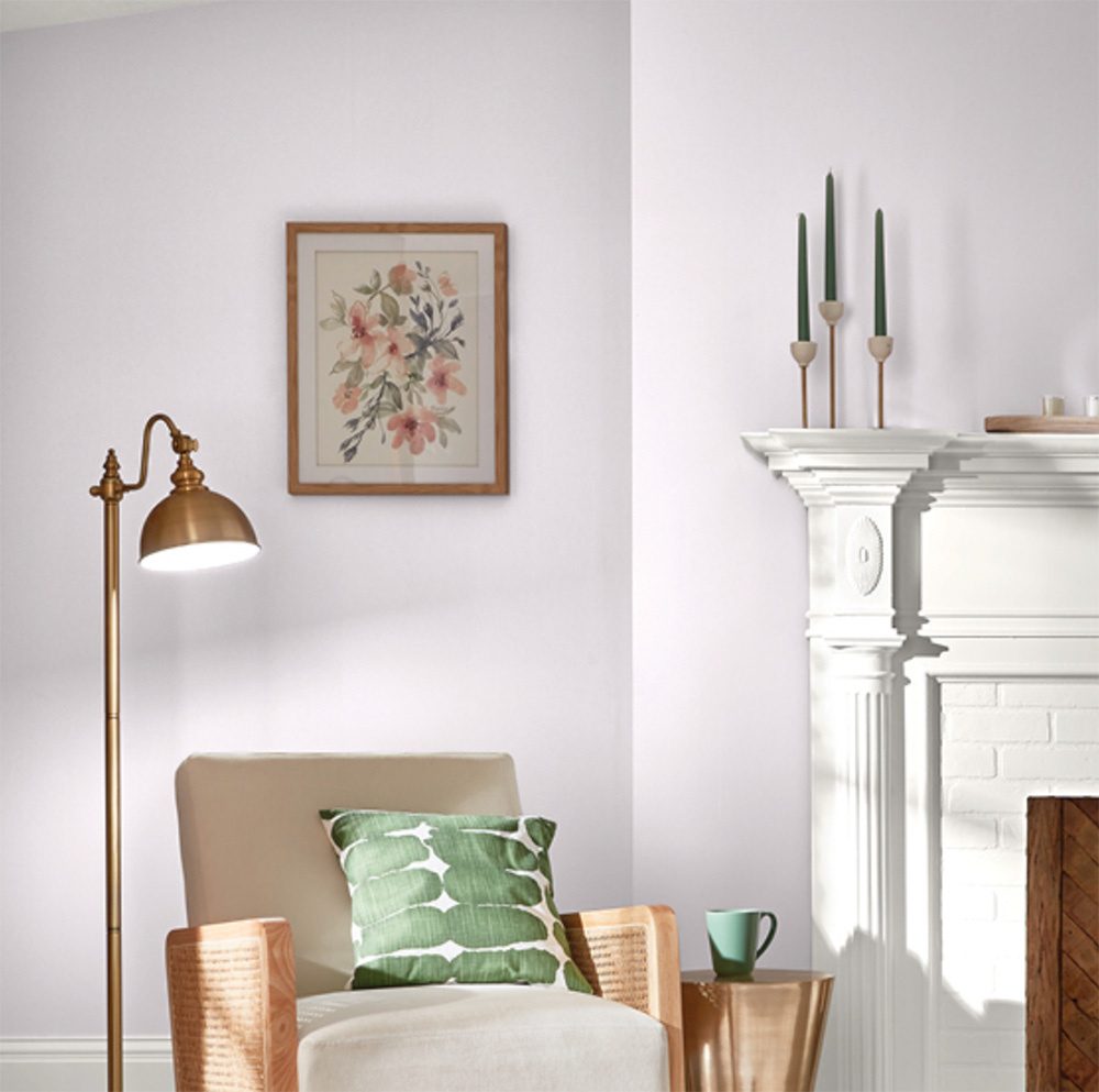
Photo credit: Valspar
“Viva Magenta” by Pantone is an excellent accent color and can be used for artwork, vases or statement pieces. Pantone viva magenta color.

Photo credit: Pantone
You can also start incorporating colors in the 2024 forecast. Sherwin Williams’ “Renewed Comfort Color Collection(link is external)” features persimmon, waterloo, dark auburn and friendly yellow—all of which are bright and bold but still soft enough to feel approachable and homey.
Sherwin Williams “Renewed”
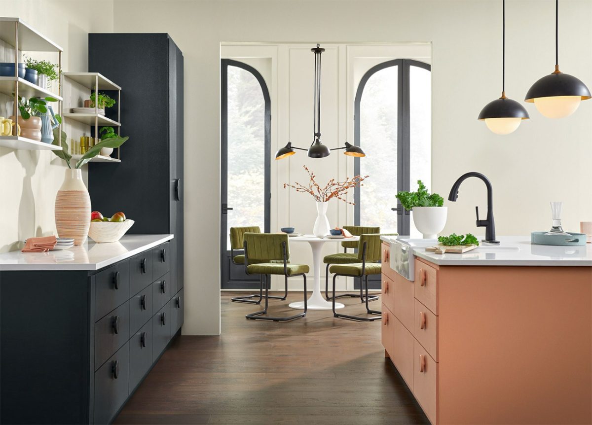
Photo credit: Sherwin-Williams
Work With a Streamlined Palette
Look for colors that complement each other and weave them into your decor. For example, you could have dark moss-green artwork with a coral accent couch in the living room and coral sculptures or tableware in the dining room. This creates a cohesive and neat look that appeals to many prospective home buyers.
You could also pair vibrant colors with soft and sculptural furniture shapes(link is external) to give the home a whimsical and eclectic feel. A buyer is likelier to remember the house with the interesting orange bean bag or ottoman than one full of neutral colors.
Use One Color for Accent Pieces
Even just a touch of color can make all the difference. Pick a shade and try to use it as a statement or incorporate different variations of it for decorative items.
Try neutrals like beige or taupe(link is external) with raspberry blush for a warm and inviting look. Focus on throws, pillows, artwork or sculptural elements. This gives a room a cozy feel that helps would-be home buyers envision themselves living there.
Use Color to Create Memorable Spaces
Colors are relatively easy to work with when it comes to interior design. They can be paired with neutrals like white, gray or beige to balance them out, or they can be mixed with other bright hues for a playful, eclectic look.
BOTTOM LINE
Choosing the right shade and using it strategically lets you create a vibrant, energetic and truly unique space. This will make houses stand out in the market and connect with people who embrace color trends and are eager to make themselves at home.
I love the article and love bringing color into the home I plan to LIVE IN, however, there is a difference in Living In and Selling the home. There may be SOME who will connect with the color palette you choose, however, you will LIMIT your targeted buyers to only those who connect with your color palette. For example, I’m more of an earth tone person with pops of cranberry red in pillows, curtains, etc. Show me a room that is painted any shade of blue on the walls and add all I see is a painting project. I like the dramatic, modern moody grays/blacks, but I also enjoy bright rooms filled with light. The moody palettes scream, new modern furniture expense to me.
In my opinion for selling a home, the walls are a light, neutral color – the palette for the room to begin. The safest way to introduce color for selling without limiting targeted buyers is to add bright, bold color in the furnishings, decor, art, soft goods, etc.
Neutral is always best when selling and add color with art, pillows, throw pillows when staging and selling a home!
As always . . .
Be sure to check out the:
- Home Valuation Tool
- Reach out for your personalized Home Value Report
- Calculate your future mortgage
Don’t forget the Home Buying and Selling Guides !
Never miss an issue by subscribing below and I look forward to speaking with you soon about your free Home Preparation and Market Analysis consultation!

Originally Published by: NAR (National Association of Realtors) | October 9, 2023

Author: Evelyn Long | Evelyn Long is the writer and editor with a passion for classic townhomes. She manages Renovated, a home improvement blog dedicated to design and DIY advice. Content by Evelyn Long.
